SnowMirror enables data to be replicated from a ServiceNow or Salesforce cloud instance to a company’s own infrastructure for further processing. That’s one of the most important reasons for using it. The further processing could be for use in a business intelligence platform such as PowerBI or SAP Business Objects BI. It could also be for use in a reporting platform such as Tableau or Qlik.
But what happens once your data is safely replicated from the cloud to your premises? When seeking to create the charts and visualisations that will form your dashboards, what are the design principles you should seek to build upon? The information presented in those dashboards is going to be used to make crucial decisions for your company, so the way it is displayed requires special care.
The field of data visualisation is a growing one, and one of its founding fathers is Edward Tufte, a professor at the Massachusetts Institute of Technology whose books are considered masterpieces not only in data visualisation, but also in nonfiction writing. As Tufte is fond of saying, “Graphical excellence is that which gives to the viewer the greatest number of ideas in the shortest time with the least ink in the smallest space.”
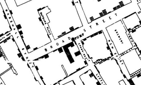
In his landmark 1997 book, “Visual Explanations,” Tufte lays out principles for charts that can be applied to BI dashboards and reports as well. To do so, he presents examples of great data visualisation from history, including Dr. John Snow’s groundbreaking work in the fight against the London cholera epidemic of 1854. In his investigations, Snow created “The Cholera Map That Changed The World,” and pioneered many of the data visualisation techniques still in use today, including overlaying points on maps and correlating those points with related bar charts and scatter charts.
Tufte and other experts in the field also warn about how charts can be made to conceal important information. In particular, he warns against aggregating data, especially when it correlates to populations, as that can make important information blend in with other, less relevant data. Again, Tufte advises, “What about confusing clutter? Information overload? Doesn’t data have to be “boiled down” and “simplified”? These common questions miss the point, for the quantity of detail is an issue completely separate from the difficulty of reading. Clutter and confusion are failures of design, not attributes of information.”
Making visualisations conceal information – and how to detect this – is also the topic of data visualisation expert Alberto Cairo’s new book, “How Charts Lie: Getting Smarter About Visual Information.” In it, Cairo examines ways visualisations can be manipulated to create certain perceptions, or on the contrary how to take advantage of good ones.
Tableau’s own documentation advises similarly. “The best visualisations have a clear purpose and work for their intended audience. What will you be trying to say with this dashboard? Are you presenting a conclusion or a key question?”
The Tableau documentation also advises a key point when designing a dashboard. “In addition to knowing what you’re trying to say, it’s important to know who you’re saying it to. Does your audience know this subject matter extremely well or will it be new to them? What kind of cues will they need? Thinking about these questions before you head into the design phase can help you create a successful dashboard.”
Whatever your chosen technique for presenting your data, you can rest assured that SnowMirror will provide it to you reliably.
If you’d like to to talk with us about how SnowMirror can help your business get the most out of ServiceNow, get in touch here.